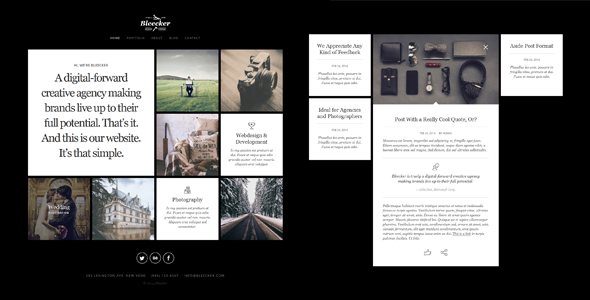
Bleecker is a responsive and retina-ready WordPress website with grid system layout. Mobile Touch optimized. Template contain many tools, integrated with WordPress administration interface to allow easy website building and content management.
Features
- Valid HTML5 / CSS3
- Perfectly Responsive
- Retina-Ready
- Cross browser compatible – tested in IE 8,9,10,11; Firefox; Safari; Chrome and Opera.
- Well formatted so it should be easy to adapt and extend
- Website includes:
- Home
- Portfolio
- About
- Blog
- Contact
- Both single page and multiple page are available
- xml file included
- Custom print css stylesheet
- Extensive documentation
Documentation / Support
If you need support, please send us an email using this contact form.
Please include the theme name, website URL and detailed information about your problem. We usually respond to support requests within
24 hours on weekdays, depending on the number of requests in queue.
Credits
Original awesome design & behaviour: PPandP.
Bleecker – Responsive Retina-Ready WP Portfolio (Photography)
No comments:
Post a Comment